Friday, May 10, 2013

R.I.P.D.


Title: R.I.P.D.

Series: Mini Series

Publisher: Dark Horse Comics

Publication Date: 1999 (Miniseries) 2003 (Trade)

Creative Team:
            Writer: Peter M. Lenkov
            Artist: Lucas Marangon
Inks: Randy Emberlin
            Colors: Dave Nestelle

Genre: Afterlife, Cop Drama, Black Comedy

I’ve never been afraid to ask a stupid question about the mechanics of a fiction world. (Embarrassed afterward? Maybe.)  For instance in Toy Story, Why do all the toys accept as a rule that they cannot reveal that they are alive?  Who made that rule?  Why do they all follow it?  Why does Buzz Lightyear follow it when he doesn’t believe he’s a toy?  I digress.  Sure Toy Story isn’t a work of great philosophical depth.  It’s not intended to spark questions of how the world functions.  It’s just supposed to be our world with another fairly simple layer on top.  RIPD hit me similarly.  Not that it’s about toys or even simple but it inspired me to ask a lot of questions about how it all works.

I don't want to know but I do.  I'm confused and scared.
The premise of RIPD is simple enough really.  Nicholas Cruz is a good cop who dies.  Once he’s dead he gets recruited to be a cop for the Rest In Peace Department (RIPD).  He’s tasked with catching demons, ghosts, and other supernatural business but before all that he has to solve his murder.  See? Simple-ish.  The plot doesn’t get much more complex than that but what made it interesting (or infuriating) to me were the implications in the background.  For instance, Nick is a rookie cop so of course he needs to be partnered with a grizzled vet close to retirement whose last partner died on the job.  It’s a cop story, that’s pretty much how they work.  That partner is Sheriff Roy Powell.  Roy is dead just like Nick and Roy’s older partner McKenzie was dead too…and then McKenzie went and died some more.  So, if you’re dead already and you die again then what?  RIPD doesn’t give us a very clear answer.  There is a Heaven and Hell in this mythos and we’re told when Roy retires he’ll go to Heaven.  So when McKenzie died for the second time did he go to Heaven or just cease to exist?  The demon killed in the same scene clearly went back to Hell.  Anyhow, it bugged me but I like to over think things (like Toy Story for instance).  But as one of RIPD’s characters says, “Don’t sweat the details, kid”.

Men without necks don't need writing on their business cards.
The story relies on a handful of clichés to set up our characters.  Nick before dying is the standard young hotheaded cop.  He dies and leaves behind a hot young widow, daughter, and dog.  Nick also had a partner that was like a brother who’s going to do his best to watch over Nick’s family.  Roy is a rough around the edges cowboy and as I have mentioned soon to retire.  Since Nick is going to be a cop in the afterlife he’s got to get there by being murdered.  After all, what’s the fun of following a dead character if they can’t solve their own murder?  It’s not to say that RIPD isn’t fun it’s just not new.  There really isn’t any innovation.  It feels like supernatural Men in Black.

They might make this look good but they don't produce music videos.
RIPD is only a 4 issue miniseries so it doesn’t have a lot of time to introduce us to the characters or the world.  This is maybe why so many clichés were relied upon to get past the setup quickly and move on to the plot.  The story moves along at a fairly quick pace and never gets boring.  Peter Lenkov has worked as a writer and producer in television since the 90s.  He helped developed and is currently an Executive Producer on the reboot of Hawaii Five-0.  I think this explains why RIPD feels so much like a TV pilot.  I wouldn’t be surprised to find out it was a rejected TV pitch that Lenkov decided to turn into a comic.  It certainly feels like a concept that could easily be mined for an off-kilter story of the week police procedural.  It’d be like Hawaii 666.  With the recent movie adaptation anything could happen.
Book 'Em Danno!
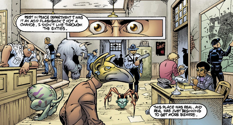
The art work in RIPD is just fun.  It fits the story nicely by setting a tone that’s not too serious.  If this comic had been drawn by someone like Jim Lee or Alex Maleev it would have been horrible.  However, to just look at Marangon’s art work you can tell he must have had a blast drawing this thing.  His characters have a cartoony feel to them.  I have no trouble imagining this book as a 90s Saturday morning cartoon show.  It could air between Teenage Mutant Ninja Turtles and X-Men without missing a beat.  I almost had to restrain myself from grabbing a pair of footy pajamas and bowl of Fruit Loops.

The Fashion Police start using Lethal Force.
Overall, I enjoyed reading this book well enough but I just wasn’t impressed by it.  I figured with the movie coming out soon it was about time I checked it out.  If they change the story a bit while adapting it for the silver screen, I won’t care one bit.  The trailer has already hilariously illustrated that the dead cops don’t appear like they did when they were alive but there is nothing of the sort in the comic.  My hope is that the movie fixes what was bad about the source material.  I guess I’ll have to wait and see.  I wouldn’t suggest buying RIPD but if you know someone that owns it or have a local library that carries it check it out.  It’s a quick read and I have certainly read worse.

So you're telling me you died in True Grit and woke up here?
Grade: C+


Tuesday, April 16, 2013

I Killed Adolf Hitler


Title: I Killed Adolf Hitler

Series: Original Graphic Novel

Publisher: Fantagraphics Books Inc.

Publication Date: 2006 (France), 2007 (USA)

Creative Team:

            Writer & Artist: Jason (John Arne Sæterøy)

Genre: Fantasy, Sci-Fi, Relationships


I Killed Adolf Hitler was the book that introduced me to Jason.  I have been reading comics for years but I’ve never encountered another comic creator quite like him.  His work is deceptive within the medium’s American comic landscape.  It would be easy to pass his work on the shelf and assume that you were looking at a comic made for children.  His characters are anthropomorphized dogs, rabbits, and birds.  His dialogue is simple and sparse.  His illustrations have a minimalist style.  It would be easy to think you were looking at a children’s book. However, that assumption would be very wrong.

From the classic Children's tale 'Mom is Horny but Daddy is a Hitman'
Jason is actually the nom de plume for Norwegian comic creator, John Arne Sæterøy.  Apart from living in Norway he’s also lived in Denmark, Belgium, and France.  Much of his work began life overseas before being translated to english and published in the United States by Fantgraphics. The interesting thing about European comics to me is how differently they have evolved over time compared to American comics.  In 1950s, American comics were attacked by Fredric Wertham in his now infamous book, Seduction of the Innocent.  These ideas gained traction when Senate hearings on the subject forced the comics industry to self regulate by forming the Comics Code Authority.  The Comics Code pushed some publishers to the point where they had to close their doors and forced entire genres out of the American comics medium.  The regulations were so draconian that famous comics writer Marv Wolfman was not allowed to have his last name in print because of its association with the mythical half-man/half-wolf creature.  But comics in Europe didn’t face these trials they weren’t forced to adapt or die.  They were allowed to grow as an art form.  In the United States, the stigma of being seen as juvenile and trivial has forced many comics creators away from anything that even gives the appearance of youthful frivolity.  A comics creator like Jason would have a hard time finding a place in mainstream American comics.  But lucky for us, he’s not American.

Nobody noticed Hitler's illiterate attempt
to read a gibberish newspaper due to an assassin's arrival. 
I Killed Adolf Hitler follows the tale (no anthropomorphic animal pun intended) of a hired hitman, his girlfriend, and a time machine.  A story with a title like this one sounds like it would be all about putting Hitler on ice but really it’s more about relationships and timing.  The story starts out in present day with the hitman and his girlfriend (who are never named) clearly having problems in their relationships.  Our hitman’s business is positively booming.  He has calls from people from all walks of life to kill people for all sorts of petty reasons.  If that weren’t bad enough competition in the hitman business is pretty stiff.  Assassinations of average people in broad daylight are a common occurrence.  The hitman would continue killing lousy bosses and noisy neighbors if it wasn’t for a client with a time machine.  The hitman can’t pass up the chance to kill Hitler and accepts but things quickly go awry.

Who hasn't tried to hire someone to kill there mother?
Just another day in the life of a hitman.

Jason’s works is often almost completely silent.  While I Killed Adolf Hitler has sparse dialogue, it’s quite verbose in comparison to works like You Can’t Get There From Here and Sshhhh!.  The dialogue Jason does include is very concise.  This works in interesting concert with his illustration style.  While his characters are dogs, cats, birds etc, there faces are almost always stoic.  They rarely betray emotions.  His stories depend more on slow burning plot lines to instill emotional weight.  He could have a character say they were lonely or their face could look depressed but instead Jason chooses to show a lonely life over time.  Through repetition he gives a clear view of what the character must be feeling without having to spell it out.  He’s not a writer you would ever accuse of telling more than showing.

Jason’s art work seems partly inspired by Herge’s ligne claire (“clear line” in french) style.  His line work has equal weight.  He never uses illustrated shading.  His colors are usually flat rather than employing the use of gradients.  His work is a fun change of pace visually from most other American comics.  However, his simplistic art style occasionally makes distinguishing characters a bit of a chore.  There was a point in the story where I had a difficult time seeing that a character had aged significantly and there were a couple times where I didn’t realize I was following a new character.  Both these issues threw off the the story for me momentarily.  

Overall I Killed Adolf Hitler despite the morbid subject matter is a lot of fun.  I think most people can relate to the relationship issues at the core of the story and who doesn’t like a little zany time travel from time to time.  If you decide to check this comic out and find you like it then I would greatly suggest looking into Jason’s other work.  Hey, Wait... is probably my next favorite of his works but be ready for a rather heartbreaking story.  Enjoy!

Grade: A+


Tuesday, April 9, 2013

Freddy Vs Jason Vs Ash


Title: Freddy vs Jason vs Ash
Series: Limited Series
Publisher: Wildstorm Comics
Creative Team:
Story: Jeff Katz
Writer: James Anthony Kuhoric
Artist: Jason Craig
Colors: Thomas Mason
Genre: Slasher, Horror, Black Comedy

No one seems concerned about burning alive but then Freddy's already done that.
 Before getting too deep into this review I think it’s worth noting that this comic isn’t for everyone.  There is fiction that’s written to be universally accessible and there is fiction written for a target audience.  Freddy vs Jason vs Ash is definitely the latter.  I have a hard time imagining someone being interested in this comic who wasn’t already a fan of one or more of the film series.  On top of that, this comic sits firmly in the Slasher genre so it will be violent and there will be sex.  If that sort of thing bothers you, you should probably seek entertainment elsewhere.  And like a group of happy-go-lucky teens who have just encountered a crazy old man prophesying doom…You have been warned!  Enjoy.
  
Friday the 13th was rebooted in 2009.  Nightmare on Elm Street was rebooted in 2010.  And now this month the reboot of Evil Dead has been released.  Before there was talk of reboots there was an attempt to bring all three franchises together.  Things didn’t pan out and a film was never made but the script was able to live on in comic form.  So I figured what better way to celebrate the reboot of the Evil Dead franchise than to visit what could have been.

I'm still waiting on that Leprechaun reboot.
Freddy vs Jason left Jason as more or less the official winner.  Freddy was brought out from the dream world (as is usually the case in the Nightmare on Elm Street series) at which point Jason was eventually able to overpower him.  However, at the end it’s made clear that Freddy has still managed to survive in some capacity.  Five years later the story of Freddy vs Jason vs Ash begins.  Crystal Lake is going through a bit of a town reboot (as is usually the case in Friday the 13th sequels).  In the wake of this redevelopment an S-mart Super Center has been constructed and is nearly ready to open.  The kids working at the new S-Mart store are more or less the same clichés you would expect to find in a post Scream slasher film engaging in the same clichéd dick and fart jokes.  Where S-mart is, Ash is not far behind.  Ash has been asked to transfer to the new store to get it ready for its big grand opening.  However things aren’t going to go too smoothly.  Jason is still at large same as usual but now Freddy is trapped in his head and desperately wants out.  Freddy’s escape requires the Necronomicon.  As you can imagine Ash will have something to say about this.  

With S-Mart's new all Deadite staff everyday feels like Black Friday at Wal-Mart!
The hardest thing about bringing Freddy vs Jason vs Ash to life has to be the tone.  All three movie franchises have gone through tone revisions.  Friday the 13th has jumped back and forth between black comedy and straight up horror.  Freddy has evolved over the years into something like a sexually charged standup comedian.  Meanwhile, in only 3 films Ash’s character has turned from a standard frightened horror movie character into the ultimate parody of masculinity.  To imagine the Ash from Army of Darkness fighting Freddy and Jason requires a tone that does justice to all three characters.  All three franchises have dabbled in comedy but comedy is a varied genre unto itself.  I think Billy Madison and I Heart Huckabees are both hilarious but the two mixed together would be a mess.  This is my main complaint with Freddy vs Jason vs Ash.

It looks like Freddy's played knifey spoony before.
Later Jason and Ash had a brutal
slap fight that left few survivors.
Freddy and Jason’s worlds mesh pretty well together.  I know not everyone liked Freddy vs Jason but for me it mostly worked.  However, adding Ash to the mix is where the problems come in.  When I think back on how Ash survived the 2 films he did (I am excluding Evil Dead because Ash isn’t really Ash until Evil Dead 2) it’s really been dumb luck more than skill.  The Deadites seemed more content to subject Ash to Three Stooges gags rather than any real attempt to kill him (Sam Raimi loves him some Three Stooges).  It’s not a problem with those films.  In Evil Dead 2 and Army of Darkness the slapstick horror worked.  The problem is Jason isn’t going to playfully poke Ash in the eyes.  Freddy isn’t going to grab Ash’s nose and then slap it.  Quite frankly Ash shouldn’t survive these encounters unless he steps his game up.  Yet throughout the whole story Ash pulls the same crap as always and meanwhile Jason and Freddy seem to dial themselves down to accommodate him.  Jason will cut people in half without stopping in one scene but in the next he’ll just throw Ash around.  Freddy will slaughter most people in their dreams without hesitation but he’ll stop and let Ash deliver a monologue.  


Nothing good can come of this.
I have spent more time with the Evil Dead series than I have either Freddy or Jason.  With my self-proclaimed PHD in Evil Dead (still waiting on accreditation) I noticed that James Kuhoric recycled a fair amount of dialogue from the original trilogy.  I know that the intent was to provide a nod to what came before but I can’t help feeling that it comes off as a little lazy.  There are three instances in Freddy vs Jason vs Ash where a spell needs to be read from the Necronomicon: once to free/give power to Freddy, once when Freddy tries to trap Jason, and multiple attempts to send both Freddy and Jason away.  All of these spells apparently require the same three magic words: Klattu Verata Nikto.  It was kind of funny the first time but even Evil Dead 2 had more magic words than that.  Beyond that Ash lifts several lines verbatim from both Evil Dead 2 and Army of Darkness.  When he’s not doing that his characterization is a bit spotty.  On the other hand Jason and Freddy feel spot on.  The move and act just as you would expect Freddy and Jason to.  Jason even has the requisite number of bizarrely creative kills (I doubt I’ll ever look at a grocery cart the same way again).

The art on this story was very hit or miss.  There were sometimes when the art was dead on perfect.  Ash looked like Bruce Campbell, Freddy looked like Robert Englund, and Jason looked like Ken (Guy from Freddy vs Jason).  But then other times it looked like a mess.  Rick Burchett is listed as Storyteller on issues 3 – 6 which I assume means he worked on page layouts.  The first two issues looked great but as the series moved on the art work started becoming more erratic.  By issue 6 the book looked like Jason Craig was rushed for time.  The level of detail had fallen dramatically and Ash is face looked right maybe a quarter of the time.  The coloring was however solid all the way through.


Ash began phoning in his personal appearance during the course of the story.

Freddy vs Jason vs Ash is certainly not going to go down in comics history as anything special but I did enjoy it.  It was fun seeing Ash take on these two modern movie monsters.  I wouldn’t rush out to buy this comic but if you see it on sale somewhere you could certainly do a lot worse.  Now we just need someone to take the material a little more seriously and get a movie made before Bruce Campbell’s too old to handle the recoil of a boomstick.  In the meantime have fun seeing the Evil Dead reboot.

Grade: B-


Friday, March 22, 2013

The Private Eye 01


Title: The Private Eye
Series Type: Maxi-series
Publisher: Panel Syndicate
Creative Team:
                Writer: Brian K. Vaughan
                Artist: Marcos Martin
                Colorist: Muntsa Vincente 
Genre: Futurist, Noir

And you thought your mom had eyes in the back of her head.
The Private Eye is the cautionary tale for our generation.  We share everything.  We scarcely go a day without voluntarily making our thoughts, feelings, and whereabouts public knowledge.  As I’ve gotten older, I’ve gotten more cynical and when I’m introduced to anything I always wonder in fascination what its end will be like.  The Private Eye shows us the corpse of the information age.  Or as our titular character puts it, “Once upon a time, people stored all their deepest, darkest secrets in something called ‘The Cloud’, Remember?  Well, one day the cloud burst.”

Secret clouds make you want to shower more than acid rain clouds.
So what do you do as a society when everyone’s ‘deepest darkest secrets’ are made public?  You hide.  The world of The Private Eye is filled with people who all have secret identities but without the powers to go with them.  In this world you may know someone but rest assured that even if it’s not obvious, they are in disguise.  But then I suppose you could say that of the world we currently live in.

The Private Eye is about (big spoiler coming) a private eye.  As we’re introduced to him, he’s doing the unthinkable.  He’s trying to get a picture of someone’s secret identity.  Apparently, this is a big no-no because he’s chased off.  The people trying to arrest him however are reporters who seem to occupy some sort of state funded police role.  

Home Sweet Office.
While the story is very colorful it has very obvious noir roots.  Our main character is a private detective who has run afoul of the local law.  Check.  Our private detective is clearly thought of as the best.  Check.  His services are required by a femme fatale.  Check.  And plot quickly thickens as we find a larger mystery in play (several larger mysteries really).  Check.  (There’s even a Maltese Falcon poster on the wall of his office).  But even with all these troupes in play the material feels fresh and new. 

Brian K. Vaughan is one of my favorite writers by far.  After getting on board Y the Last Man and Ex Machina late, I vowed to jump aboard any of his future projects sight unseen.  And so far I’m 2 for 2 (I’m also reading Saga, which P.S. You should check out).  Brian’s characters are always 3 dimensional.  They feel like real people that you could meet or have already met.  His stories are character driven.  And of course, wrapping his characters in an interesting high concept universe helps too.


It may look like Marda Gras but this is just a normal evening in the future.
I’ve seen Marcos Martin’s work here and there and I have to say that while I enjoyed it he rarely was working on comics I wanted to read.  His art is very unique in today’s comic landscape and I’ve been waiting to see a project from him I was interested in.  With The Private Eye, I need look no further.  His style is fairly minimalist and his colors are sharp.  With all the elaborate costumes in this comic there is plenty to pour over.  This book looks beautiful.

What makes The Private Eye extra interesting is the way it’s formatted and distributed.  Vaughan and Martin have chosen to ‘sell’ there comic online completely free of DRM (Digital Rights Management).  They have setup a site @ www.panelsyndicate.com where you can choose how much you would like to pay per issue (you can choose to pay nothing if you like you cheap basterd).  Once you’ve paid (or chosen not too) you can select to download the comic as a PDF, CBR, or CBZ file.  You can also download it in English, Spanish, or Catalan (I’m sorry to say I had to look this one up; I won’t spoil it for you).  Beyond that The Private Eye has pages formatted for a widescreen tablet presentation.  You don’t have to scroll through a page with this one.   I’m sure there are other people out there producing and distributing comics this way but I have personally yet to come across two highly regarded creators doing so. 

Vaughan and Martin have so far expressed their intention to make The Private Eye a ten issue maxi-series.  I’m excited to see where it goes and hopefully you are too.  There is no reason not to pick up this comic immediately.


Friday, October 5, 2012

Rachel Rising Vol. 1 The Shadow of Death


Title: Rachel Rising Volume 1 The Shadow of Death

Series: Monthly Ongoing

Publisher: Abstract Studio

Creative Team: 

            Writer & Artist: Terry Moore

Genre: Horror, Suspense


Rachel wakes up in a shallow grave.  She has no memory of how she got there or much of anything in the past couple days.  Her neck is bruised and her eyes are blood red where they should be white.  Rachel manages to find her way home.  She quickly enlists her Aunt Johnny and best friend Jet to help her try to unravel the mystery of what happened.  (If I ever make an anti-bucket list of things to avoid doing before I die, being buried alive will be at the top of it).  Rachel begins to wonder if she survived the incident that led to her burial or if she has died and come back.  If all that weren’t enough, Rachel keeps seeing a strange woman whose appearances always precede someone’s death.

This series is creepy.  It’s a smart kind of creepy.  These days in horror anyone can give you a jump scare.  It’s cheap and easy like a hot pocket.  Anyone can gross you out with the right sound or the right image (again, like a hot pocket).  Rachel Rising doesn’t try to give you gross, squishy, jump scare horror.  It is delivering something eerie, something that feels wrong and disturbing on a deeper level.  That is the kind of horror that I love.  It’s the kind of horror that’s much harder to pull off.  Moore delivers it like an old pro.  I don’t know if he’s written anything else in this genre before but he certainly has a handle on it.

Rachel is a little low on tact these days.
Aside from being great horror, Rachel Rising is an excellent example of how to positively portray women in comics.  In mainstream American comics, that’s sort of like finding a unicorn and a leprechaun having a splash fight in the fountain of youth.  Ok, it’s not quite that bad but it’s bad enough that finding a comic that features real women is still something to be applauded.  And by real women I mean, Terry Moore is not drawing ridiculously exaggerated girls who seem to be perpetually posing for Maxim.  But anyone who’s read Moore’s work before shouldn’t be surprised by his remarkable grasp on the female form.  It’s also the first comic I’ve reviewed that’s passed the Bechdel test.  And when I say pass, I mean it in the sense that Stephen Hawking would pass a high school algebra test. 

What is the Bechdel Test?  I’m so glad you asked.  Alison Bechdel is a comic artist/writer who wrote a comic strip called Dykes to Watch Out For.  It ran from 1983 to 2008.  As I understand it, it’s on hiatus right now and still may be brought back.  In one installment, one of the characters says that she will not watch a movie unless it satisfies 3 rules.  One: The movie contains at least 2 female characters.  Two: Those two characters talk to each other.  Three: When they talk, they talk about something other than men.  It is absolutely ridiculous how few works of fiction can pass this seemingly simple test.  The test is all about drawing attention to the flagrant gender bias that exists in fiction.  That all being said Rachel Rising has 3 strong female leads who after 6 issues have only talked about relationships with men for a couple pages at most.

Beyond passing the Bechdel test I get the feeling that Terry Moore is purposely drawing a gender line in the sand for his characters.  Most of the men presented in the first volume of Rachel Rising are portrayed as degenerate in one way or another.  There is really only one male character so far portrayed as a decent human being and he was only present for a page or two.  Beyond that we are presented with abusive, rage-filled, possibly necrophilic men.  Moore even goes so far as to have all female dialogue in rounded word balloons and all male dialogue in rectangular.  I have my theories as to why this is but it would be rather spoiler filled.

Like they say boys speak in rectangles, girls speak in ovals.
Rachel Rising is the comic I never knew I always wanted.  I don’t know how long Terry Moore is intending the series to run but if subsequent volumes are as strong as the first I’m hoping for a long exciting run.  Do yourself a favor and pick up this series to get your October started off right.

Grade: A+

Monday, October 1, 2012

Richard Stark's Parker The Hunter


Title: Richard Stark’s Parker Book One The Hunter

Series Type: Yearly Ongoing

Publisher: IDW

Creative Team:
            Writer & Artist: Darwyn Cooke

Genre: Crime, Noir

It took me about 10 pages into The Hunter to realize I had heard this story before.  Over a decade ago, I drove an hour out of my way to see Mel Gibson play this character (renamed Porter instead of Parker) in the movie Payback.  I know that movie may not have been the best received but I absolutely loved it.  I immediately bought the VHS (yep) upon release and eventually traded up for the DVD (No Bluray yet.  I’ll keep you posted).  I knew it was based on a book but over the years I had forgotten which one.  So there I sat only a couple minutes into Darwyn Cooke’s adaptation of The Hunter and I already knew I loved the story.  The only question was Cooke’s presentation.  Would he nail it or not?  (Spoiler alert, he nailed it).

The resemblance is all in the thick eyebrows.

The Hunter is the first in a series of comics by Darwyn Cooke adapting Richard Stark’s Parker Novels.  As I understand it, there are 16 novels by “Stark” about the Parker character.  So far Cooke has adapted 3 of them.  Richard Stark is one of the numerous pen names for the rather prolific, Donald Westlake who passed away about 4 years ago.  I haven’t read any of his novels (under any pen name) but I’ve really enjoyed the adaptations I’ve come across so far.  So hats off to Mr. Westlake and hats off to Darwyn Cooke and Mel Gibson for bringing him to my attention.  However, my “To Read” pile just increased by about a dozen and half.  Worse things have happened.

Parker hates when people try to talk to him when he's on the phone.

On to the story with minor spoilers!  You have been warned.  The Hunter is about a man named Parker.  Parker, like Madonna or Prince, is long past the need for more than one name. Parker’s story in the Hunter is about as basic as it gets, revenge. Someone tried to kill Parker and made the mistake of not finishing the job.  Before you go feeling sorry for Parker I have to say that he is a
bastard.  If there’s anyone that probably deserves to die it’s Parker but that’s sort of the fun of the story.  For a tale like this to work the people Parker is after have to be worse than he is.  They are worse, to be sure.  But fortunately for Parker while he is no worse than his prey, he is clearly smarter.  To say anything more than that would spoil the story. And in all honesty, saying even this much spoils the near wordless cold open just a little.  (There’s the minor spoiler you were warned about). So I’ll keep my mouth shut on the plot and move on to the quality.

First off, you can get each volume of Cooke’s Parker novels in trade form or in hardcover.  Do yourself a favor and buy the hardcover.  IDW has put out a very slick looking package.  Cooke’s art has always had sort of a Bruce Timm-Batman the Animated Series look to me.  Since all of those DC comics superhero shows always had a wholesome feel, it’s a little jarring to see that sort of style used to depict a world of violence, drugs, and prostitutes.  After regaining my bearings I have to say that I really enjoyed that art.  The characters are well rendered and I mostly could tell who everyone was just from faces.  The white, black, and blue color scheme served the story well.  I have to wonder if Cooke will shift his third color from volume to volume.  The black and blue look worked well with this very bruised feeling story but maybe red or green would fit the next story better.  I don’t know.  I guess I’ll have to wait and see.

Cooke does a great job of sitting back and letting his art tell the story.  A picture is worth a thousand words, yet some comic writers still attempt to describe what you’re looking at.  I think this happens a lot more in non-fiction indie comics.  So I was pleased to see Cooke knows when to draw and when to write.  It’s hard to properly pace a comic with several wordless pages but Cooke pulls it off with finesse.

After seeing Mel play the character in Payback all those years ago I’m glad to find out there is more to Parker’s story.  I’m excited to see where Parker’s path of destruction leads next and I’m happy to have Darwyn Cooke to lead me there.

Grade: A+


Wednesday, September 19, 2012

The Massive 1 - 3

Title: The Massive
Series Type: Monthly Ongoing
Publisher: Dark Horse
Creative Team:
Writer: Brian Wood
Artist: Kristian Donaldson
Colorist: Dave Stewart
Genre: Environmentalism, Post-Apocalpyse
Ninth Wave's The Kapital and The Massive
The Massive is quite honestly a cross section of things I don’t know much about and ideologies that I haven’t spent much time considering.  To me that’s the fun of fiction.  I love a good story but a good story that challenges me to learn more, to research, to critically think; that’s infinitely better.  It is a bit of a double edged sword though.  Since The Massive is so far out of my personal experience I am often left wondering about the accuracy of the concepts being referenced.  Be warned there are minor spoilers from here on.

From Left to Right: Callum, Mary, and Mag
The Massive is the story of an environmentalist group known as Ninth Wave.  Ninth Wave consists of two ships; The Kapital and The Massive (Hey, that’s the title of the series).  Ninth Wave was founded by an ex-mercenary named Callum Israel.  Along with Callum, Ninth Wave is populated by mostly pacifistic volunteers from a variety of countries.  The most prominent crew members are Mary and Mag.  Mary is a seasoned environmentalist with whom Callum is currently in a relationship.  Mag served as a mercenary alongside Callum several years previously.   However unlike Callum, Mag seems to have retained his willingness to get his hands dirty when necessary. During the past year, a laundry-list of natural disasters have occurred all around the world leaving the Earth’s socioeconomic and environmental landscapes in ruin.  These disasters have included things like tsunamis, earthquakes, blackouts, and mass extinctions.  The question Ninth Wave now has to answer: What does it mean to be an environmentalist when the world has already ended?


One of the many odd catastrophes facing the world of the Massive

Brian Wood’s writing on the series has been quite good.  The Massive is clearly the work of a well researched and intelligent individual.  The dialogue is good and the characters have very detailed back stories (which I feel is apparent even though we don’t get to look behind the curtain too much yet).  Sometimes Wood’s writing is a little too text book.   It’s like he spent so much time figuring out this new world scenario that he couldn’t wait to get it out in the story.  It’s interesting to hear what’s gone on but it does slow down the main narrative quite a bit.  Not a lot happens to or with our main characters in these first three issues.  Still I’m excited enough about the series to stick with it and see where things go.

The narrative of each issue so far jumps back and forth between the past and the present.  The flashbacks usually come in 2 flavors; dry documentary style cataloging various catastrophes and character driven moments usually focusing on aspects of the world that have changed.  Dave Stewart does an excellent job of shifting color palettes in order to help the reader juggle the various non-linear narratives.  In a complex story like this, jumping around in time could be very messy but Brian Wood’s writing and Stewart’s colors keep things clear.  


An example of the coloring used to transition between past and present.
Kristian Donaldson’s artwork is excellent.  The characters are very distinct and the varied locations are always sharp and heavily detailed. I can’t stress enough the impressiveness of distinct characters in a series like this.  There are too many monthly comic artists who rely on the crutches of costumes and hair color to help the reader keep characters straight.  Kristian has no need for such things.  If I had any complaint at all about the art (and it is a bit nit-picky, I admit) it would have to be the covers to 2 - 4.  Issue 1’s cover is gorgeous (it’s my wallpaper on my work computer) but there’s a sort of sketchy unfinished quality to rest of the covers.  If the interiors looked like those covers (especially 3) I think I might be a little turned off to the series.


Overall, the artwork is excellent, the writing is thoughtful, and I’m excited to see where things go.  

Grade: A-